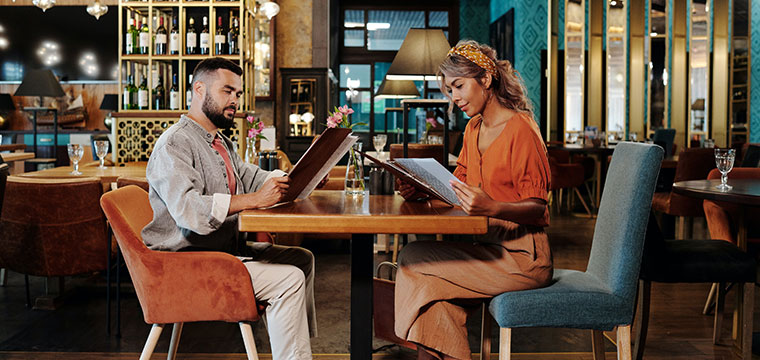
Before your customers feast on your food, they first look through your menu. Follow these strategies to grab their attention and design the perfect restaurant menu.
5 Essential Restaurants Menu Design Tips
Have you ever thought about how much your restaurant’s menu can impact its success? If you answered yes, you’re already on the right track.
A restaurant menu is much more than just food names and corresponding prices. It’s a marketing and psychological tool that heavily influences how customers choose their dishes—and more importantly—how they perceive your restaurant.
Your restaurant menu holds a lot of influence, and it’s a crucial factor in your restaurant’s success. But to maximize its positive impact, you need to have the right design elements. Interested in learning how to design a menu for a successful restaurant business?
Then let’s explore how you can cook up the perfect restaurant menu.
5 Strategies for Designing the Perfect Restaurant Menu
A menu is a lot more than a list of dishes and drinks at your restaurant. In fact, it can easily persuade your customer to buy one dish over another. For example, a study at Iowa State University found that kids who saw a photo of a salad were 70% more likely to order one. This was most likely because the picture made it look appetizing since most kids probably wouldn’t think to order a salad otherwise.
As you can see, each detail of your restaurant menu matters.
So, here are 5 strategies you can use to make every detail of your restaurant menu its very best.
1 – Entice Through Description
Whether it’s a familiar dish or something your customers have never heard of, a dish’s description can be the determining factor for customers to order it. According to menu engineer Gregg Rapp, having well-written descriptions in your restaurant menu can boost profits up to 30%.
Take a look at these sample descriptions of a classic hamburger and see for yourself how persuasive wording can be:
- Simple Description. Half-pound beef hamburger with American cheese, lettuce, and tomatoes.
- Enticing Description. A juicy, half-pound, pure beef hamburger with crisp lettuce, fresh tomato slices, and melted American cheese.
We all want to eat the second one, right?
That being said, there is a caveat here. Always remember to highlight your restaurant menu items with honest descriptions. Although the goal here is to entice your customers, you need to be honest since lying is a form of false marketing. Review your dishes and focus on what makes them delicious for customers to form accurate, yet favorable, expectations.
2 – Organize for Simpler Ordering
Customers may not know specifically what they want, but they have an idea of the kind of dish and how much they want to eat. A study by Harvard Business Review found that when customers can easily navigate choices, they are likely to spend more because of higher scores in the decision simplicity index.
Arrange your menu items in the same order as meal courses.
Use this menu outline as a guide:
- Soup. Cream of Squash, Tomato & Basil, Clam Chowder
- Salad. Caesar Salad, Salade Niçoise
- Appetizer. Calamari, Bruschetta, Shrimp Cocktail
- Main Courses. Porterhouse Steak, Roast Chicken & Vegetables
- Dessert. Panna Cotta, Chocolate Mousse, Apple Pie
- Beverages. Juices, Sodas, Hot Beverages, Alcoholic Drinks
Note: Beverage portions of a restaurant menu have their own sub-categories.
And one more tip, adjust your restaurant menu according to the cuisine and type of food items you serve. The guide shows categories commonly found in all restaurants, but of course, you still need to specify in line with what your restaurant offers.
3 – Pick Your Pictures
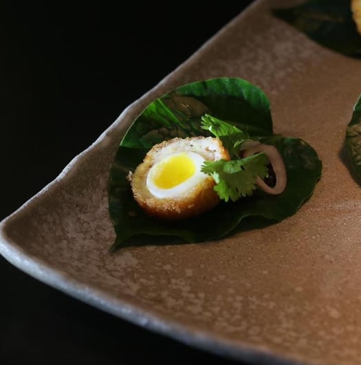
Putting pictures on your restaurant menu increases desirability and the likelihood of ordering more. However, the positive impact of these pictures will also depend on the quantity, quality, and photo style.
If you have a high-end restaurant, a few high-quality, elegantly styled pictures will be appropriate. If you plan on growing a chain restaurant like Chili’s or Fridays, having more pictures can come off as more inviting to the general public. It’s also more accessible if your restaurant is in a tourist district and gets a lot of foreigners who don’t speak the same language.
Take a look at these pictures from different restaurants to get some inspiration:
High End

Bars & Pubs
-Aug-13-2022-11-46-12-81-AM.png?width=540&name=unnamed%20(4)-Aug-13-2022-11-46-12-81-AM.png)
In a nutshell, what kind of pictures and how you use these on your restaurant menu will depend on your branding, goals, and target clientele.
5 – Divert Attention from Prices
Customers will indulge themselves more if they are less concerned with the price. Think about a buffet at a set price and how customers’ dining behavior is drastically different compared to a la carte dining.
Unlike buffet dining where you pay a fixed price for any amount of food, a la carte dining requires customers to pay per dish. Apart from the dining style, the main difference here is that customers factor in the price before ordering food.
What’s the solution? Narrow the focus on the food.
Here are ways you can do this:
- Use Smaller Fonts for Prices – Captivate your customers with enticing descriptions and mouth-watering pictures to make the price an afterthought. If you convince them to want the dish first, a high price will be less dissuading since their desire will be stronger. The objective here isn’t to hide the price, but to make it less attention-grabbing.
- Disassociate Spending – It’s a small detail, but leaving out the currency sign psychologically disassociates customers from the burden of spending. If you want to take this strategy to the next level, you can even spell out the price instead of using numbers
6 – Add Design Details
Remember: Each detail matters. And that includes the small details your customers might not even think they notice. Here are some ways to add a bit more flair to your restaurant menu:
- Choose Your Colors – Color psychology is nothing new. The colors you use on your menu can tell a lot about the vibe and branding of your restaurant. The color yellow, for example, evokes happiness and hunger.
- Branding Through Typography – Another way restaurants and establishments communicate their branding is with the type of font used. Higher-end establishments like Paul Bakery opt for minimalistic and elegant fonts. On the other hand, chain restaurants use louder and more attention-grabbing fonts.
- Illustrations Instead of Photography – Because of food styling and advertising in recent years, some customers find restaurant menu photos deceptive. Instead of using pictures, give your restaurant menu design an edge with illustrations and graphics to minimize deception bias and have a more universal appeal.
Understanding the Psychology of a Restaurant Menu
A restaurant menu isn’t just sheets of paper with food items and prices. It’s a powerful marketing and psychological tool that influences your customers’ selection and spending behavior. By perfectly engineering your restaurant’s menu design, you can maximize your profits with every customer.
With this, you can narrow their focus to what’s most important—the delectable food and drinks your restaurant offers.
Start your restaurant journey with Mosaic Solutions’ POS software solution and so much more. Contact us today!
